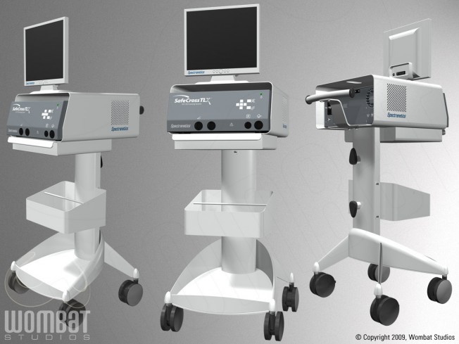
CTO System: Assorted Views
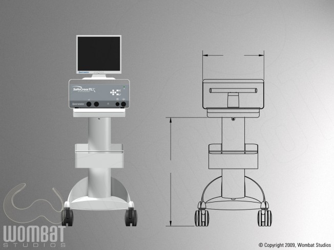
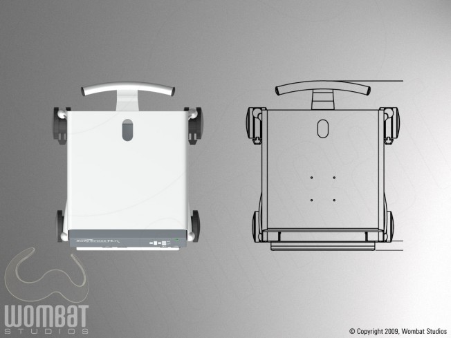
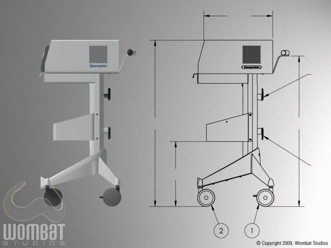
This project originally started as a pre-visualization of a medical device system; the cart and computer were being redesigned, and the client wanted to see it in 3D with different colors on different components. What they sent initially were the drawings below, and those are shown next to the same views after modeling the elements.
CTO System: Front View
CTO System: Top View
CTO System: Side View
After the cart and computer were modeled, they came back and asked to have logos placed on the different elements; while working on that, it was decided that we would supply printer-ready labels for not only the logos, but also the other button labels. This meant that models now needed to be accurate, with correct placements of ports and buttons. They sent us more detailed drawings and measurements, which were matched up in Illustrator to the initial drawings; new plan images were output to correct the models themselves; and then back in Illustrator we created the 2D labels, icons, and placed the logos. This work was a project in and of itself, easily as much work as creating the initial models.
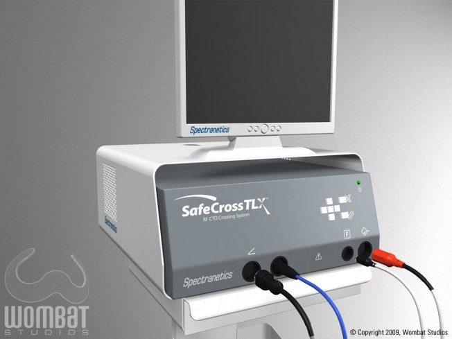
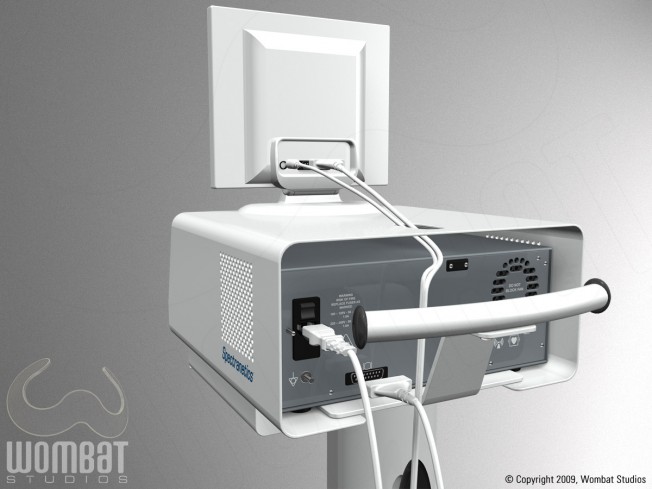
Finally, we were asked for illustrations showing the setup process of the system (what plugs into where, and in what order), and the following images were the basis for the setup guide.
CTO System: Setup Front View
CTO System: Setup Back View
This project isn’t the most visually exciting, nor does it push the bounds of 3D by any means. It’s included here, though, because it showcases the benefits of 3D – rapid prototyping, pre-visualization, the ability to alter and change without starting over, and after all of that having a good base to create illustrations from. Not all projects are big, or visually exciting, but every project is important to us. And even on smaller projects, fine details can go a long way towards making something look more interesting.
